Je bent je ingevulde velden bij deze pagina aan het verwijderen. Ben je zeker dat je dit wilt doen?
You are erasing your filled-in fields on this page. Are you sure that is what you want?
Nieuwe Versie BeschikbaarNew Version Available
Er is een update van deze pagina. Als je update naar de meest recente versie, verlies je mogelijk je huidige antwoorden voor deze pagina. Hoe wil je verdergaan ?
There is an updated version of this page. If you update to the most recent version, then your current progress on this page will be erased. Regardless, your record of completion will remain. How would you like to proceed?
We discuss how to use our tools to create detailed sketches of functions beyond the ability of precalc tools.
Video Lecture
_
Text and Additional Details
We’ve covered all kinds of ways to interpret different levels and values of derivatives graphically. Typically we’ve done this by looking at a
graph and deducing things about the derivatives to build intuition and ultimately get to a new result or understanding. Now it’s time to
go the other direction! We will be using derivatives to create a detailed sketch of a function which we would otherwise
have little hope of sketching with only precalculus knowledge. Before we begin though, there are two things to keep in
mind.
First and foremost, this is really something best learned and seen via examples. For that reason there will be plenty of
example videos available for this process. Secondly, it is easy to get lost in the gritty details of careful computations
when actually doing an example and miss the bigger picture. That bigger picture is what we attempt to discuss in this
segment.
By way of warning then, be aware that we will be deliberately omitting a lot of the careful calculations involved in this segment because
we are specifically after the “big picture” right now. In essence the example videos will show how to do the calculations, and which
calculations need to be done, but this segment is more about interpreting what the calculations are telling us and how to translate that
into a graph. For this reason don’t feel alarmed if you aren’t sure how a calculation was done or where a specific equation came from, that
will be covered in detail in the example videos. You want to focus on how we translate the result of the calculation into a
graph.
The goal of this segment is to...
Determine what kinds of calculations need to be done to make a detailed sketch of a graph.Get a bigger picture idea of what is
happening - how to turn calculations into a detailed sketch.Find a way to get calculations from a detailed sketch of a graph.Learn
enough to pass an exam.
So, our goal is to turn a function into a reasonably detailed sketch of a graph. To this end, let’s start with a function. Consider the
following function: . Using our derivative rules and factoring techniques we can get the following:
Now we want to list the zeros for each. has zeros of and , has zeros of and , and has as its only zero. So all together we have as zeros ,
, , and . Next we want to build sign charts for each of these. It is ideal to build a sign chart that has all the zeros for each function as we
will be breaking these up into regions, but if you want to do them separately that works just as well - just make sure to keep straight
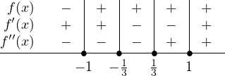
where the overlaps are. If we opt to include all the zeros and do a single chart that has all three functions, we get the
following:
From this we can determine if we have maximums, minimums, and/or inflection points, and what the -values are for each of them. In
particular, we can see that goes from positive to negative at , so that is the value of a local maximum. Similarly, is a local minimum
since transitions from negative to positive. We can also determine that is an inflection point since the second derivative changes sign at
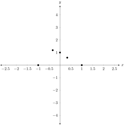
that value. Finally, we can plug in all these values, along with (which gives us the y-intercept) to get the following list of points and why
they are important:
, are -intercepts (where is zero)
is the -intercept (compute )
is a local maximum. (where goes from positive to negative sign)
is a local minimum (where goes from negative to positive sign)
is an inflection point (where changes sign)
Ok, now that we have all the calculation parts done, it’s time to translate this all into a graph!
First, we start with a blank canvas:
Next up, we want to add in the points we already know for certain. These are all those points we listed a moment ago:
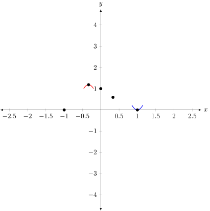
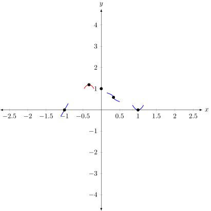
As a suggestion, it helps to (lightly) sketch a little curve through points to represent what they are. For example, for the maximums and
minimums we can draw little parabolic curves through the points. They don’t need to be perfect, or even good, they are just to show you
how the curve is suppose to pass through the point in general. Let’s see what I mean with just the maximums and minimums
first:
Now, these curves aren’t exactly accurate - just looking at how far down the curve on the maximum is going there is no way it will end up
hitting the y-intercept correctly, but that’s not the point. The point is to show me how to go through the point correctly once I have
everything set up and ready to go. Let’s add in a curve to represent the inflection point (going from concave down to concave up) and the
correct way to pass through each of the x-intercepts.
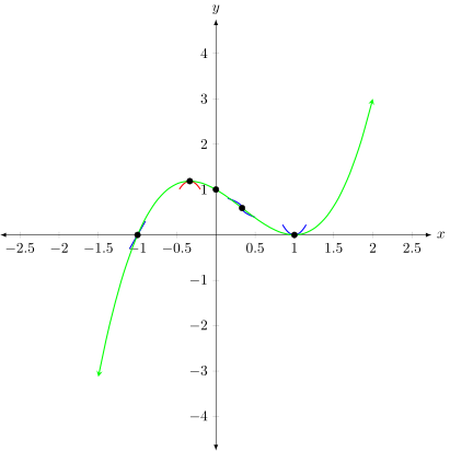
Finally we want to record the end-term behavior by calculating the limit as approaches positive and negative infinity - which turn out to
be negative infinity to the left and positive infinity to the right. Once we have this, we want to try and smoothly connect the dots,
going through each one in the way we’ve sketched as close to naturally as we can. We should end up with something like
this:
We can see that the sketch segments didn’t quite line up perfectly as we tried to draw the full graph smoothly through all the points, but
that’s ok! We only put those sketched segments there in order to know how the graph was suppose to pass through the point; whether it
was suppose to arch away from the point to make a local extrema, or pass straight through, or go through but change
concavity, etc. Keep this in mind when doing your own sketches, and remember that this isn’t an art class - we should be
precise and accurate where we can (like when we found the specific points for the maximum, minimum, inflection points,
zeros, etc) but this is still a sketch... just a much more detailed sketch than you would expect from a student in, say,
precalculus.
So, we saw how we can use the ideas from derivatives like concavity and finding local extrema, along with some concrete values like
intercepts, to make a much more detailed sketch of a graph than we could before we had the tools from calculus at our disposal. Graphing
might seem like a somewhat abstract and theoretical application, but consider how many times we’ve pulled useful information out of a
graph so far in this class alone. Being able to have a reasonably accurate graph, especially one that includes things like local and
absolute extrema and inflection points, can be a powerful tool when presenting data or determining trends, or even
trying to decide on a course of action for a company. There is a reason visual aids are so popular in presentations - they
help!
 Business Calculus One