Je bent je ingevulde velden bij deze pagina aan het verwijderen. Ben je zeker dat je dit wilt doen?
You are erasing your filled-in fields on this page. Are you sure that is what you want?
Nieuwe Versie BeschikbaarNew Version Available
Er is een update van deze pagina. Als je update naar de meest recente versie, verlies je mogelijk je huidige antwoorden voor deze pagina. Hoe wil je verdergaan ?
There is an updated version of this page. If you update to the most recent version, then your current progress on this page will be erased. Regardless, your record of completion will remain. How would you like to proceed?
This section describes one of the most useful tools in mathematics - especially in
calculus - the sign chart!
Often in the real world it turns out that actual numbers aren’t terribly important, at
least for things like quick summary data, or to get a general idea of what is going on
with something. It is perfectly natural to ask, for example, “did we make money or
lose money this week?” or “did you beat the record or not?” These questions might
be followed up with more specific numeric answers (how much did we lose? How
much did you beat it by?) but the initial question doesn’t need a numeric answer, it
just cares about whether you passed some kind of threshold - i.e. whether
you are above or below some line (the break-even point, or the previous
record). In this video we examine a really easy way to do this with continuous
functions - and how to display the information in a fairly natural way - The Sign
Chart.
Lecture Video
_
Text and details
In mathematics, the easiest way to divide the notion of being “past” some benchmark
or not, is to consider whether the value is positive or negative. Typically this means
we would arrange our function to represent the value we consider the “benchmark” as
zero, and then test whether the function is positive (above the benchmark value) or
negative (below the benchmark value) at whichever points we want. But, in the case
where we have continuous functions there is an even easier way to do this kind of
test - by breaking our domain into intervals and using the continuity to our
advantage.
Let’s consider an example:
Say we have a function that tells us the profits of a company over time (in
months), which is given as . We want to know which over which months the
company is making a profit, and over which months the company is losing
money.
To do this, we will start by finding all the zeros of the function - which
times where we are exactly breaking even. To do this, we can use the zero
product property - that a product of things is zero if and only if one of
the factors is zero. This means that we want to know when each factor is
zero, i.e. when , , or . So, solving each of these individually we get , , and
.
Next we want to know where the function is continuous. This is easy to overlook, but
is especially important as the sign chart is explicitly exploiting the continuity
property - so it only works where the function is continuous. The easiest way to
account for this, is to record any values where the function has a domain
restriction. In this particular case there are no restrictions, so we don’t have to
record any values for this part - this is because polynomials are continuous
over all real numbers (something we will cover more later in the polynomial
section).
Finally, to understand what we are about to do, recall our definition of continuity -
that a function is continuous between two points if we can draw the graph between
those two points without picking up our pencil. (As a note here, we will have a
better definition of continuity in calculus, but this is our definition for this class.)
This means that, if we had a positive function value and a negative function value in
some interval, then the function would have to cross the x-axis somewhere
between those two values, which means it would equal zero there. But another
way of saying this, is that between any two zeros, the function has to be
restricted to being either entirely above the x-axis or entirely below it (this is
where we are exploiting continuity, without continuity this statement isn’t
true!)
So, with that in mind, we are ready to draw our sign chart!
The first step was finding all the zeros of the function, and all the domain restrictions.
We did this and found that our function has no domain restrictions, and has zeros of
, , and .
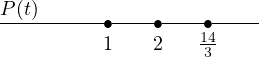
Step two is to draw a number-line with only the domain restrictions and zeros listed,
and our function above the line on the left. In our case we have:
Notice that I didn’t include zero or any other “centering” value on the line, I only
put the zeros of the function (and the domain restrictions, if there were
any). Technically adding extra values to the line here won’t produce an
incorrect result, but it will generate more work for you to do to get your
answers.
Step three, we want to test values between the labeled points. To be clear, it doesn’t
matter at all which value you choose to test a given interval, as long as it is
strictly between the endpoints on the interval. For example, if we want to test
the interval between and , we could pick , , or even . But... some of these
values are obviously more of a pain to calculate than others. Indeed, since it
doesn’t matter which value you choose, try to pick a value that is easy to
compute with. In this case I would pick , but whatever value works for you is
good.
But there is an important note here. We are not trying to actually compute
the value at that point. In fact, the only thing I care about is whether
the function is positive or negative at that value. So when we pick a
number like to “compute” with, what I actually want to do is determine
if the function is positive or negative at , not what the function actually
equals. This can be a difficult thing to embrace for students, since you’ve
been hammered with the “be precise and give a numeric answer” for more
than a decade of schooling at this point, but not explicitly computing has
advantages.
For example, if I am using , I would plug in the into the original function, getting .
Actually computing this would get me to the step and multiplying out those values
would be... annoying. In contrast however, I can look at each of the factors and
determine if the value is positive or negative - again in our case we get that the first
factor is positive, the second is negative, and the third is negative. Then, instead of
multiplying the numbers, we can determine whether is positive or negative by
multiplying the signs: positive times negative times negative is positive, so
is positive. Again, what actually equals isn’t important for a sign chart,
just whether it is positive or negative - and remembering this can save you
considerable time and headaches when dealing with annoying intervals like this
one.
We continue testing each interval - for the interval between and we could use .
Doing this we would end up with a positive times a positive times a negative, giving
that is negative between these two values.
One might think we are done, but we need to remember the left and right intervals
too, meaning the interval and . The good news here, is that we can choose any value
in the interval. Although you might be tempted to pick something like
for the left interval or for the right interval, it’s often easier to pick some
kind of absurdly large number - again the goal is to not actually compute
a value at all. This is much easier if we are picking absurd numbers. For
example, if we pick for the right interval, we don’t even need to actually add
or subtract the or or in each factor, because those numbers are way too
small to do anything to change the sign of . So we know all three factors
are positive, and thus the right most interval is positive. Similarly if we
choose , then each of the three factors will stay negative (since the massive
negative number will overpower the values being added to it in each factor) and
so, multiplying three negatives together gives that the far left interval is
negative.
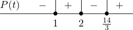
So, we have found that on the interval is negative, on the interval is positive, on
the interval is negative, and on the interval is positive. We can represent this in
the sign chart by putting a positive or negative sign above each interval, like
this:
Finally, we can use this chart to answer our original question: When is the company
making profit and when is the company losing money? According to our sign chart,
the company is making money (positive profit) in the interval , i.e. between the end
of month one and month two, which is all of February, as well as all the months past
which corresponds to about two thirds of the way through the fifth month - or
around May 20th, give or take. The company is losing money during the
other times - specifically for all of January and between March 1st and May
20th.
It turns out, for those planning on taking calculus, the sign chart is incredibly useful
in nearly all of calculus, and will show up dozens or even hundreds of times in
calculus one alone for lots of different applications. As such, it is invaluable to get
comfortable with building a sign chart now for those intending to move on to
calculus.
 Universal Objects and Properties