Je bent je ingevulde velden bij deze pagina aan het verwijderen. Ben je zeker dat je dit wilt doen?
You are erasing your filled-in fields on this page. Are you sure that is what you want?
Nieuwe Versie BeschikbaarNew Version Available
Er is een update van deze pagina. Als je update naar de meest recente versie, verlies je mogelijk je huidige antwoorden voor deze pagina. Hoe wil je verdergaan ?
There is an updated version of this page. If you update to the most recent version, then your current progress on this page will be erased. Regardless, your record of completion will remain. How would you like to proceed?
A description of how images and graphs are rendered or included.
1 How Ximera renders Image and Graph Content
There are several ways to embed graphics into Ximera document.
2 TikZ
The preferred way to include graphics is with TikZ.
\begin{image}

  \begin{tikzpicture}

    \begin{axis}[

        xmin=-6.4,

        xmax=6.4,

        ymin=-1.2,

        ymax=1.2,

        axis lines=center,

        xlabel=$x$,

        ylabel=$y$,

        every axis y label/.style={at=(current axis.above origin),anchor=south},

        every axis x label/.style={at=(current axis.right of origin),anchor=west},

      ]

      \addplot [ultra thick, blue, smooth] {sin(deg(x))};

    \end{axis}

  \end{tikzpicture}

\end{image}
3 Including images
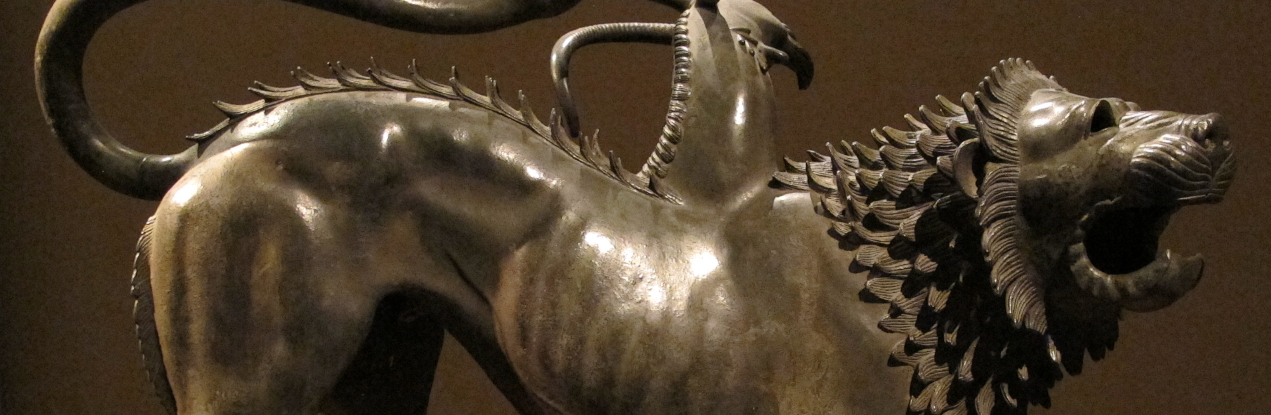
Another method is to use \includegraphics. Here we see an included a JPEG and a
PNG:
\begin{image}

  \includegraphics[width=.3\textwidth]{missionPatch.jpg}\qquad

%% chimera.png is licensed under the Creative Commons Attribution-Share

%% Alike 3.0 Unported license.

%% Attribution: I, Sailko

%% https://commons.wikimedia.org/wiki/File:Chimera_d%27arezzo,_fi,_04.JPG

  \includegraphics[width=.3\textwidth]{chimera.png}

\end{image}
In the code above, the command image is just a Ximera provided wrapper that can
be redefined for printing. It does automatically resize content though and can be
useful for showing images side-by-side:
Here we have a pdf
Another way to include graphics is to use Tikz. In some sense this is preferred, as
then the source produces the images.
\begin{image}

  \begin{tikzpicture}

    \begin{axis}[

        xmin=-6.4,

        xmax=6.4,

        ymin=-1.2,

        ymax=1.2,


        axis lines=center,

        xlabel=$x$,

        ylabel=$y$,

        every axis y label/.style={at=(current axis.above origin),anchor=south},

        every axis x label/.style={at=(current axis.right of origin),anchor=west},

      ]

      \addplot [ultra thick, blue, smooth] {sin(deg(x))};

    \end{axis}

  \end{tikzpicture}

\end{image}
3.1 The graph command
The easiest way to include an interactive graph is to use the \graph command.
Unfortunately, the \graph command doesn’t draw a graph in the PDF, rather, it
states (in words) that a graph is produced. There are a number of options for the
\graph command:
 Xronos Examples